Monday 27 February 2012

Audience Profile

This is an image I've put together to display the type of person that would listen to my music video and like the artist I have created. By creating this image its a quicker and more visual way of getting across who I want my target audience.
The clothing: casual hoodies, shirts and jeans worn simply with ugg boots or plimpsoles. This all adds up to a very casual but appealing look. The type of girl that doesn't try to hard but still would want to look nice. She is happy with how she looks and confident in herself.
The interests: Amy Winehouse, James Morrisons, Desperate Housewives, Take Me Out. These are just some of the music interests and television shows my audience would listen to and watch. They like a unique taste in music not necessarily whats in the charts. She would have her ritual television shows that are watched every series on a weekly basis and the tv shows that are watched on a nice night in just for the sake of it but are actually quite funny.
Out and About: Hobbies, She is the type of girl who boys may be important but not as important as a night out with the girls with cocktails. Going out for dinner to nandos or TGI Fridays, strong social life but she has her feet firmly on the ground.


Monday 20 February 2012

Anamatic

Here is where I drew a sequence of images (excuse the bad drawing) to plan out the idea of my music video and to give me a better idea of how the final product will look.

Sunday 19 February 2012

Pitch Board - Directors Pitch Part Two

To the left I have a pitch board of my ideas for my music video. These are only my initial ideas and as I go on to create my anamatic of where I will be able to draw out the camera work, the continuity, the mise en scene and the overall look of how its going to go in the real thing during this phase I'm sure i will have more ideas and inspiration on what to do. But I have a very strong start on video creation phase.
To the left I have a pitch board of my ideas for my music video. These are only my ideas and as I go on to create my anamatic of where I will be able to draw out the camera work, the continuity, the mise en scene and the overall look of how its going to go in the real thing during this phase I'm sure i will have more ideas and inspiration on what to do. But I have a very strong start on video creation phase.


To the right there is pitch board to demonstrate more of the location, to give a clearer idea of where I want to be doing my shooting.

My Video Concept - Directors Pitch Part One

The concept of my video:

The video will be simple and meaningful just like the lyrics and other Adele videos where I have got my inspiration from. I will use a lot of close ups and eye contact with the camera, making the audience feel strongly connected with the song with the singer and with the video. I will use a lot of love connotation in the video such as flowers (he loves me he loves me not), red and hearts etc. There will be a strong element of loneliness in this video as there will only be the singer in the video and she will be the focus throughout, there could be a busy mise en scene moving past her but still portraying loneliness. The visuals will link strongly with the lyrics and music for example when the line 'to make you feel my love' something on screen will be repeated each time we hear those words.

Lyric Deconstruction

These lyrics are pretty self explanatory, there aren't many hidden meanings just purely that she is in love with someone and wants to tell them how much she feels for them. It was originally written and sung by Bob Dylan but Adele does it amazingly. The lyrics are just expressing the deep and emotional feelings felt by the singer. The simple lyrics with metaphors and repetition used throughout the song are to show the true emotion which needs to be backed up with a simple music video.

It gives me the impression that she isn't in a relationship with the muse of this piece but if she were 'There is nothing that I wouldn't do, to make you feel my love'

Goodwins theory implies that the lyrics and visuals have a direct link either supporting or contrasting. These lyrics have to be supported by the visuals as it wouldn't work the other way round.

Reflective Analysis Adverts - Part Three

Monday 6 February 2012

My Own Artist's Advert - Prototype 1


Here are my two demo ideas for my advert, these would both appear on billboards and in magazines for example 'Cosmopolitan' these are both strong ides using text. The album name 'Make Me Feel Your Love' and the artist's name 'Hanna' featuring on both. The adverts are not only there to promote the artist and raise awareness but also marketing of the album to achieve maximum sales possible. Once I have taken my own images I will use them instead of images found of the original artist.

Advert Analysis - Birdy

This advert is very different, this follows strictly the codes and conventions of a typical artist advert. With song titles, artist name and other promotion websites advertised along the bottom. This reflects the type of artist Birdy is and what you can findfrom her album. As a very new artist and a young female singer she is just trying to find her feet in the artist world, fitting in and making something of herself. Her music is easy to listen to and down to earth showed in this advert by the colours, nothing in your face and the positioning of the artist her self. The clear image with pastel colours and overall simplistic look is what the label are promoting. This advert was on social websites such as Facebook. As the target audience for Bidy and Facebook matches its obvious to advertise where the audience will be.
The girly simple font that the text is written in shows the simplicity and girlyness of her voice, the pure talent this would appeal to the audience as they want nothing but the roar talented voice. This advert is showing her innocence with lack of sex appeal or the bright colours, a strong personality trait to connotate in an advert.
Ideas I have taken from this advert:
●simplicity
●song titles
●use of other media platforms to advertise

Advert Analysis - Jessie J


In this advert for Jessie J there is a strong image with lack of text this is quite an unconventional advert. This advert was found on huge billboards that couldn't escape everyone's notice. This image was produced when Jessie J first hit the music scene and 'stomped' into our earphones, the purpose to was to promote her first album. The image screams the attitude Jessie J brings with her music. The lack of text on this advert is unusual as it doesn't necessarily state what it is advertising. The point of the missing text was to just simply raise awareness of her as an artist. And to play with human emotion as the less you know about someone but more you see them, the more likely you are to want to find out about it and want to discover more. This strategy worked very well as everyone now knows who she is.
The actual image is a powerful and strong. The overall comic feel to the image, the background is a dark night time scene in a city with the clouds connotating the villain side of the story line in a comic book. Added with the clothing of Jessie J the tight black revealing clothes with heals suggesting she isn't just a girly girl with the hair and the heals but has a 'badass' side to her personality and music. The focus put to her lower half of her body shows that she wants to be seen as sexy as well suggesting that her music isn't only aimed at females combined with the 
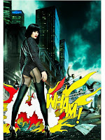
idea of a comic. Comic books are traditionally targeted at males, the fire cartoon 'WHAM!' effect this really strikes the audiences attention and allowing this image to stick into their mind. This text is a direct reference to Andy Warhol art work this intertexual factor of the advert is like having an inside joke with the audience they would recognise this artwork and take more notice to the advert as a whole.
Ideas I have taken from this advert:
●lack of text
●rebelling from codes and conventions
●photoshoped background
●strong contrast