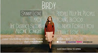
This advert is very different, this follows strictly the codes and conventions of a typical artist advert. With song titles, artist name and other promotion websites advertised along the bottom. This reflects the type of artist Birdy is and what you can findfrom her album. As a very new artist and a young female singer she is just trying to find her feet in the artist world, fitting in and making something of herself. Her music is easy to listen to and down to earth showed in this advert by the colours, nothing in your face and the positioning of the artist her self. The clear image with pastel colours and overall simplistic look is what the label are promoting. This advert was on social websites such as Facebook. As the target audience for Bidy and Facebook matches its obvious to advertise where the audience will be.
The girly simple font that the text is written in shows the simplicity and girlyness of her voice, the pure talent this would appeal to the audience as they want nothing but the roar talented voice. This advert is showing her innocence with lack of sex appeal or the bright colours, a strong personality trait to connotate in an advert.
Ideas I have taken from this advert:
●simplicity
●song titles
●use of other media platforms to advertise
No comments:
Post a Comment