
In this advert for Jessie J there is a strong image with lack of text this is quite an unconventional advert. This advert was found on huge billboards that couldn't escape everyone's notice. This image was produced when Jessie J first hit the music scene and 'stomped' into our earphones, the purpose to was to promote her first album. The image screams the attitude Jessie J brings with her music. The lack of text on this advert is unusual as it doesn't necessarily state what it is advertising. The point of the missing text was to just simply raise awareness of her as an artist. And to play with human emotion as the less you know about someone but more you see them, the more likely you are to want to find out about it and want to discover more. This strategy worked very well as everyone now knows who she is.
The actual image is a powerful and strong. The overall comic feel to the image, the background is a dark night time scene in a city with the clouds connotating the villain side of the story line in a comic book. Added with the clothing of Jessie J the tight black revealing clothes with heals suggesting she isn't just a girly girl with the hair and the heals but has a 'badass' side to her personality and music. The focus put to her lower half of her body shows that she wants to be seen as sexy as well suggesting that her music isn't only aimed at females combined with the
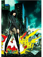 idea of a comic. Comic books are traditionally targeted at males, the fire cartoon 'WHAM!' effect this really strikes the audiences attention and allowing this image to stick into their mind. This text is a direct reference to Andy Warhol art work this intertexual factor of the advert is like having an inside joke with the audience they would recognise this artwork and take more notice to the advert as a whole.
Ideas I have taken from this advert:
●lack of text
●rebelling from codes and conventions
●photoshoped background
●strong contrast
No comments:
Post a Comment