Hello my name is Ruth Bound and welcome to my blog.
Here will be shown each stage to making my music video, digipak and advert.
Thank you, enjoy :)
Monday, 14 May 2012
Wednesday, 2 May 2012
My Music Video
Here is the link to my final music video
-
http://www.youtube.com/watch?v=WbGU0JPv7kI&feature=youtu.be
-
http://www.youtube.com/watch?v=WbGU0JPv7kI&feature=youtu.be
Tuesday, 1 May 2012


Tuesday, 24 April 2012
Evaluation - Question Four
Here is the answer of question four) How did you use new media technologies in the construction and research, planning and evaluation stages?
I have used the following technologies throughout my media
production phase. Including software, hardware and websites.
|
Video Camera
|
DSLR camera
|
Adobe Photoshop
|
|
Sony Vegas
|
Microsoft office
|
Mobile phone
|
|
tripod
|
keyboard
|
laptop
|
|
mouse
|
|
|
|
Internet:
|
||
|
www.facebook.com
|
||
|
www.google.com
|
||
|
www.blogger.com
|
|
|
Where the technology was used?
During my research part of my project I used google and
Microsoft Office throughout as this is where I could brain storm ideas as well
as write down all the information I had gained. This is where I used a lot of
the websites such as http://www.adele.tv/home/
and http://jessiejofficial.com/ to find the biographies and know more about
similar artists.
After the research part of my project I moved on to the
prototypes of my digi-paks this is where some of the software I used came into
place. Photoshop helped me to take images from the internet and transform them
into CD front covers and adverts, promoting my artist. Shortly after this I
went onto my filming of my video, for this I used my Video Camera and tripod
for the actual filming of each scene. My mobile phone was also used as I played
to song as my artist could sing along to help with the lip syncing. During
filming I took my DSLR camera with me, this would allow me to take the images
to use on the digi-pak and the advert.
My next
step was to do the editing, cutting and cropping to make all the footage add
together and to create a aesthetically
pleasing products. This involves the laptop mouse and keyboard to work Sony
Vegas videoing software programme, along with photoshop for the images.
Evaluation - Question Three
Here is the link to the video explaining my answer to question three) What have you learnt from audience feedback?
http://www.xtranormal.com/watch/13306938/media-evaluation-3-audience-feedback
http://www.xtranormal.com/watch/13306938/media-evaluation-3-audience-feedback
Evaluation - Question Two
Evaluation - Question One
Here is the answer to the evaluation question one) In what ways does your media products use, develop or challenge forms and conventions of real media products?


Friday, 16 March 2012
Contact Sheet For My Final Video

Wednesday, 14 March 2012
Feedback - Video 1
After showing my initial video:
- Good lip syncing with the audio track
- Like the pure performance aspect as it displays the emotion well
- The clothing isn't quite right, as the artist shouldn't be in black as its a song about love
- Performance wise, needs to cut out laughter as artist needs to take it seriously
Advice:
- Re- shoot some scenes where the artist is laughing
- The parts where the camera work is very shaky try and edit out
- For the future, don't let the artist wear black
After I had gained this feedback I could notice what the potential audience were saying and agreed. This made me decide to re do my video as I felt I could do it do a better standard. As I have left my self enough time I will proceed to re film my video
The original video - http://www.youtube.com/watch?v=Lx5g7NYf1fA&feature=youtu.be
Tuesday, 6 March 2012
Filming - Take Two - Music Video
re is my contact sheet. I will now put together the video, editing it all together and then show it to an audience in the target range and gather feedback.

Friday, 2 March 2012
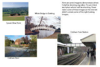
Filming - Re-Think
First Hiccup.
Having gone to the train station to film part of my video I have discovered that I am not allowed to film on the platform without having written permission. I was told this could take months so I decided to re think my anamatic and go in a different direction without using the train station.
Monday, 27 February 2012
Audience Profile
 This is an image I've put together to display the type of person that would listen to my music video and like the artist I have created. By creating this image its a quicker and more visual way of getting across who I want my target audience.
 The clothing: casual hoodies, shirts and jeans worn simply with ugg boots or plimpsoles. This all adds up to a very casual but appealing look. The type of girl that doesn't try to hard but still would want to look nice. She is happy with how she looks and confident in herself.
The interests: Amy Winehouse, James Morrisons, Desperate Housewives, Take Me Out. These are just some of the music interests and television shows my audience would listen to and watch. They like a unique taste in music not necessarily whats in the charts. She would have her ritual television shows that are watched every series on a weekly basis and the tv shows that are watched on a nice night in just for the sake of it but are actually quite funny.
Out and About: Hobbies, She is the type of girl who boys may be important but not as important as a night out with the girls with cocktails. Going out for dinner to nandos or TGI Fridays, strong social life but she has her feet firmly on the ground.
Monday, 20 February 2012
Anamatic
Here is where I drew a sequence of images (excuse the bad drawing) to plan out the idea of my music video and to give me a better idea of how the final product will look.
Sunday, 19 February 2012
Pitch Board - Directors Pitch Part Two
 To the left I have a pitch board of my ideas for my music video. These are only my initial ideas and as I go on to create my anamatic of where I will be able to draw out the camera work, the continuity, the mise en scene and the overall look of how its going to go in the real thing during this phase I'm sure i will have more ideas and inspiration on what to do. But I have a very strong start on video creation phase.
To the left I have a pitch board of my ideas for my music video. These are only my ideas and as I go on to create my anamatic of where I will be able to draw out the camera work, the continuity, the mise en scene and the overall look of how its going to go in the real thing during this phase I'm sure i will have more ideas and inspiration on what to do. But I have a very strong start on video creation phase.
To the right there is pitch board to demonstrate more of the location, to give a clearer idea of where I want to be doing my shooting.
My Video Concept - Directors Pitch Part One
The concept of my video:
The video will be simple and meaningful just like the lyrics and other Adele videos where I have got my inspiration from. I will use a lot of close ups and eye contact with the camera, making the audience feel strongly connected with the song with the singer and with the video. I will use a lot of love connotation in the video such as flowers (he loves me he loves me not), red and hearts etc. There will be a strong element of loneliness in this video as there will only be the singer in the video and she will be the focus throughout, there could be a busy mise en scene moving past her but still portraying loneliness. The visuals will link strongly with the lyrics and music for example when the line 'to make you feel my love' something on screen will be repeated each time we hear those words.
Lyric Deconstruction
 These lyrics are pretty self explanatory, there aren't many hidden meanings just purely that she is in love with someone and wants to tell them how much she feels for them. It was originally written and sung by Bob Dylan but Adele does it amazingly. The lyrics are just expressing the deep and emotional feelings felt by the singer. The simple lyrics with metaphors and repetition used throughout the song are to show the true emotion which needs to be backed up with a simple music video.
It gives me the impression that she isn't in a relationship with the muse of this piece but if she were 'There is nothing that I wouldn't do, to make you feel my love'
Goodwins theory implies that the lyrics and visuals have a direct link either supporting or contrasting. These lyrics have to be supported by the visuals as it wouldn't work the other way round.
Monday, 6 February 2012
My Own Artist's Advert - Prototype 1

Here are my two demo ideas for my advert, these would both appear on billboards and in magazines for example 'Cosmopolitan' these are both strong ides using text. The album name 'Make Me Feel Your Love' and the artist's name 'Hanna' featuring on both. The adverts are not only there to promote the artist and raise awareness but also marketing of the album to achieve maximum sales possible. Once I have taken my own images I will use them instead of images found of the original artist.
Advert Analysis - Birdy
This advert is very different, this follows strictly the codes and conventions of a typical artist advert. With song titles, artist name and other promotion websites advertised along the bottom. This reflects the type of artist Birdy is and what you can findfrom her album. As a very new artist and a young female singer she is just trying to find her feet in the artist world, fitting in and making something of herself. Her music is easy to listen to and down to earth showed in this advert by the colours, nothing in your face and the positioning of the artist her self. The clear image with pastel colours and overall simplistic look is what the label are promoting. This advert was on social websites such as Facebook. As the target audience for Bidy and Facebook matches its obvious to advertise where the audience will be.
The girly simple font that the text is written in shows the simplicity and girlyness of her voice, the pure talent this would appeal to the audience as they want nothing but the roar talented voice. This advert is showing her innocence with lack of sex appeal or the bright colours, a strong personality trait to connotate in an advert.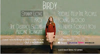
The girly simple font that the text is written in shows the simplicity and girlyness of her voice, the pure talent this would appeal to the audience as they want nothing but the roar talented voice. This advert is showing her innocence with lack of sex appeal or the bright colours, a strong personality trait to connotate in an advert.
Ideas I have taken from this advert:
●simplicity
●song titles
●use of other media platforms to advertise
●simplicity
●song titles
●use of other media platforms to advertise
Advert Analysis - Jessie J

In this advert for Jessie J there is a strong image with lack of text this is quite an unconventional advert. This advert was found on huge billboards that couldn't escape everyone's notice. This image was produced when Jessie J first hit the music scene and 'stomped' into our earphones, the purpose to was to promote her first album. The image screams the attitude Jessie J brings with her music. The lack of text on this advert is unusual as it doesn't necessarily state what it is advertising. The point of the missing text was to just simply raise awareness of her as an artist. And to play with human emotion as the less you know about someone but more you see them, the more likely you are to want to find out about it and want to discover more. This strategy worked very well as everyone now knows who she is.
The actual image is a powerful and strong. The overall comic feel to the image, the background is a dark night time scene in a city with the clouds connotating the villain side of the story line in a comic book. Added with the clothing of Jessie J the tight black revealing clothes with heals suggesting she isn't just a girly girl with the hair and the heals but has a 'badass' side to her personality and music. The focus put to her lower half of her body shows that she wants to be seen as sexy as well suggesting that her music isn't only aimed at females combined with the
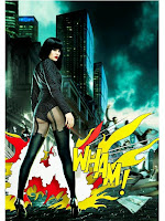 idea of a comic. Comic books are traditionally targeted at males, the fire cartoon 'WHAM!' effect this really strikes the audiences attention and allowing this image to stick into their mind. This text is a direct reference to Andy Warhol art work this intertexual factor of the advert is like having an inside joke with the audience they would recognise this artwork and take more notice to the advert as a whole.
Ideas I have taken from this advert:
●lack of text
●rebelling from codes and conventions
●photoshoped background
●strong contrast
Monday, 30 January 2012
Biography For My Own Artist - Hanna

I made a facebook profile page for my artist this is where her biography can be found for her fans. This is as she is quite new to the music scene and her target audience and facebook is directly aimed at the same audience. This is where fans can find the latest news and information on the artist including where abouts and new tracks etc.
This image is good to show where the biography will be shown you cant however read the writing, so the biography I have written is copied below.
'There is nothing cliché about me, what you see is what you get' Strong words spoken by our very popular new soloist Hanna. Recently slitting from her band 'Pluto' she goes it alone in the big music industry world. Just like any other artist music has been a strong part of her life ever since she was a teen 'I was forever being told off by teachers for rolling up to school with Amy Winehouse or Etta James blasting out my speakers, but hey I wasn't bothered' Her relaxed attitude is loved by her massive fan base.
Family being a big part of her world, it would come above the fame and fortune any day! Hanna and her mum have a special bond that is inspiring. Due to certain circumstances that happened when Hanna was little but she isn't one to duel on the past. 'I love my mum, she is just like me but older, I'm sworn to secrecy how much older!' Hanna comes from what some people would call 'common' background but this just means she appreciates everything she has and will get out of life. 'I am pretty down to earth, quite happy to get down and dirty' she winks and laughs.
As an artist she had to start somewhere and has worked her way up from the bottom of the pile, with her uncles friend offering her a record deal 'I’m not a fan of taking favours so I wasn’t overly happy but it was an opportunity I couldn’t miss out on. But and this is a big but as soon as he tried to change me, my image, my songs I was out of there quicker than 18 year old to the pub' she laughs. The record company tried to control Hanna and change what she stood for, her look, her personality and her song writing and that was the last straw! After dumping the stupid record company Hanna was soon back to singing on trains with head phones in and music loud. 'I'm not afraid to stand up for myself and no one else should be' Even though she had thought she had thrown away her only route to cheering fans, albums, number 1 single, concerts and all that jazz she stayed positive and continued to write her amazing, moving, breathtaking lyrics. ' I believe in making every situation beneficial!'
In june 2009 Hanna was given a record deal from 'OutLine Records'. 'The best thing that could possibly have happened to me.' They are a great support of her music, her song writing, her independence and her as an overall artist. Hanna then rushed from gig to gig with little time to recover in between. 'It was like a constant hangover but I enjoyed every second' One of the best parts of her career yet was when a fan recognised her in her local Tescos. The idea that someone had recognised her through the power of her voice and asked her to sign a receipt blew her mind! 'I attacked this poor girl with a bear hug, looking back on it now is a little embarrassing but never mind I WAS FAMOUS' she shouts.
Hanna's fan base is still growing as she continues to work her way up the charts and grab the public's attention with the emotional songs written and performed by this gutsy loud beautiful artist. We hope to see a lot more from Hanna! And in her words 'Laters'
Sunday, 29 January 2012
Creating My Initial Album Cover - Prototype 1
I have created several different ideas for my album cover, to try different techniques to then further decide what I would like my final album cover to look like.


My first idea is this -
This album cover is based on an image of Adele her self. An idea I got from the album cover analysis of Duffy's cover is the text. I used this technique to re enforce the idea of a personal touch which I think is important for an artist the hand written name with an 'x' to give that extra girlyness showing affection to her fans. The brown of the background i thought would show off the image the best, as well as setting the tone of her songs. The variety of songs the audience will find on this album are an easy listen nothing to loud with a relaxing down to earth feel. The scribble effect I used when creating this album on photoshop is to connotate that nothing permanent. This is a saying that is used by my artist a lot and that is a strong belief On the real copy I will be using my own image that will also be a natural looking image nothing to posed as the fans will recognise she is just being herself.
My second idea -
This is my second idea for my album cover, is this strong paint image with the artist name and album name clear on the cover with a slight red tint. All factors relating straight to my artist, firstly the red tint to the cover applied after the black and white effect is showing how its striped right back but with slight tint of colour. This is connotating the songs on the album how it is resembling the heartache the sole source of the mood of the songs on the album. The paint splatter is creating the look of mess and the artist is underneath the mess. Connotating that the real person is underneath all the mess and splatter. Creating an interesting image and meaning that could intrigue the audience. The text of the album name and the artist name (which will be replaced with my artist name) clear on this image in informative font but a female and freindly font inviting the public to buy the record.
The third idea -
This image is black and white with text layer over the top in colour reading 'Hanna' the artist name even though not too clear compressed on here. The colour is the key message in the cover, the black and while showing simplicity of the artist added with the bright colour effect of the text with her name showing that her voice could bring the brightness needed in to her audience's life. The strong eye contact is crucial in this album as she is making that connection with the audience instantly persuading them to purchase. The simple and plain back ground means that the focus is immediately directed to her name, more memorable. If I wanted to make this my final album cover I would need to improve the coloured letters to make it clearer to read.
I like all these ideas when it comes to creating my final cover I will use an original image of my created artist 'Hanna'
Reflective Analysis Biographies - Part Two
After analysing two biographies, firstly Jessie J and secondly Adele her self it has equipped me with all I need to create a biography for my own artist. Both analysis's outlined different factors that i can include, whether I want a more relaxed personal touch like Adele's or a more informative approach like Jessie J's.
My artist is definitely a bubbly more chatty artist so I feel that taking the more personal informal approach would be appropriate as she is a new artist and needs to therefore establish her fan base. I will also be using the technique like both biographies of both I plan to use a lot of direct quotes from the artist and focusing on the real highlights of her career so far!
As every other successful artist out there, she will need a strong web presence using the most popular facebook, twitter and myspace. When creating my biography I will use one of these sites to base it on with other key information about 'Hanna'
Biography Analysis - Adele
Adele's biography found on her own fan website is different to Jessie J's with the mode of address even more casual with the effect of a conversation the similarity is the use of quotes throughout the biography.
As I mentioned the mode of address is very different
, the first difference is the tone in which the quotes are written by Adele. They are as if we are in a conversation with her, very relaxed but comes off well to the audience because it makes it feel personal when reading it. This is good as its on the fan page directed directly at the fans this will make them feel more involved. Between each quote there is the description written by someone else which is full of compliments giving us the impression that Adele is an inspiration someone to look up to. Contrasting the tone of the quotes to the description with one serious and the other not so much, 'I’d go round and we’d jam and stuff like that' to 'it wasn’t until 2006 that labels started noticing her talent' this keeps the reader interested.
There is a lot of talk about how she became to where she is now, differently to how the previous biography was done. This comes off In her favour as this engages her fans into her whole life right from the beginning to now. As this whole biography is meant to be conveyed to the audience as inspiring. The life stories are all positiv
e parts and are just the different stages of her career, that have got her to where she is now.
Adele as an artist is represented as an inspiration who doesn't fits the usual stereotype of a 20 year old female singer. She is shown to stand up for herself and not giving up. This is great for her fans to read as with the personal touch it could give each person to achieve there goals whether it a singer or the president.
Adele as an artist is represented as an inspiration who doesn't fits the usual stereotype of a 20 year old female singer. She is shown to stand up for herself and not giving up. This is great for her fans to read as with the personal touch it could give each person to achieve there goals whether it a singer or the president.
As most other artist's she too has facebook, twitter and myspace page, allowing virtually instant updates from the amazing artist.
Biography Analysis - Jessie J
Jessie J's biography is found on her official fan page, like other artists its written by someone else packed with quotes from Jessie herself. As a new artist she doesn't have a lot of experience to talk about the music industry, but this doesnt mean she spends the whole biography focused on the past. This is the only place how ever you can find out about Jessie J with her facebook, twitter and myspce pages.
The style of the writing is very much the same as when she performs with slang and very down to earth, for example 'perfect fringe slashed above the eyes' this is describing her hair a big part of jessie j's image. The whole biography homes in on what is current and her image now. The writer just touching on the bad points in Jessie J's career in the past, but overall with a very positive tone throughout. Unlike some biographies where they contain great detail in a back story of how the artist became where they are now focussing on negatives for the sympathy vote, this is just striaght to the point.
The layout consists of lots of small paragraphs this is supporting the idea that its a factual bit of writing, from a young person who is a short and snappy artist wanting to get her story across. This also reflects the audience she is targeting as they are young 15-25 year old women most likely to be fashionable student types. These aren't the type of audience that wants to read a long page of writing they want short paragraphs making it look easy to read.
The layout the mode of address and where the bio was found all reflects the audience as its for directly Jessie J's fans, its not to recruit knew fans and widen her fan base its just a little something for her fans to learn more about there idol.

The facebook, twitter and myspace page are all there and easily accessible. On these websites fans can follow and be updated frequently with jessie j's latest news. Here you can find little paragraphs about jessie j which is informal bitesize bits of information that will keep the fans interested.
Reflective Analysis So Far - Part One
I have analysed music videos, and album covers that are similar genre to the artist I will be creating and marketing, this has allowed me to look at the codes and conventions that should appear on my album cover as well as in the music video. I have talked about key points and explained the purpose of each feature. This has opened my mind up to what I should be thinking about doing for my promotional pack.
From Jessie J's simplistic performance/concept video I have taken the idea of simple shots with simple editing to create the emotional feel I want to convey in my own video.
Beyonce's If I Were A Boy, is a strong narrative based video. I love having a twist in the storyline shown in the visuals and the clear relationship between lyrics and visuals relating to the concept from goodwin's theory.
Birdy's concept/performance video is similar to Jessie J's with the code and conventions with editing but creating a completely different feel that I would like the channel into my video. The strong use of mise en scene throughout the video with clear planning made me consider this about my video and start to plan the details.
The album cover research has helped me a great deal, when looking for artist that are similar to my future artist helped me gain knowledge of what is needed on a album cover. Using two quiet different covers let me broaden my initial ides when it came to creating my own. From this task i was aware of each feature that is important when creating my own, the picture, background, text, colour scheme, layout, setting, position in frame and many more.
My next step is to start thinking about the life story of my artist which will therefore help me tune the details in which I can then go on to creating a demo album cover without using my own images but thinking about the techniques or ideas that I want to experiment with. In the next section I will also be looking at artists biographies and how I plan to write my own, thinking about the mode of address, the way I want my artist to be seen etc etc.
Sunday, 22 January 2012
Album Cover Analysis - Duffy

Rockferry is the début album from the singer Duffy, released on 3 March 2008 in the United Kingdom by A&G records, targeted at 18-40 woman. This cover overall has a very personalised feel, a connection with the fans/audience even without the eye contact. The first thing that is noticeable is the black and white effect the lack of colour on this album is giving an old fashioned look a unique look. Duffy is the type of artist where it is truly about her music the focused should be fully focused on her voice. The second thing about this image that really grabs my attention is the train in the background, this can connotate an escape or journey. Depending on the audience it could mean either, using Duffy's music to escape or Duffy herself uses her music to escape reality for awhile. Or on the other hand it could suggest the journey you can take with Duffy with this album or for a fan she is able to comfort you on your journey in life. The train is a very strong feature on this cover. Add this to the smplstic mise en scene of her clothing, hair and make up infers that she is a natural singer, very down to earth easy to connect with. The hand written text 'Duffy' in the top left corner is made to look like an autograph, for the target audience who would buy this CD would be more likely to buy this album as it feels like Duffy has personally signed it for each person. Very different to the text along the bottom of the CD this is a more informative font suggesting that this is still a serious and important album that is worth the money. The lack of eye contact with the camera and audience is unusual for anything that is trying to sell as the eyes make a connection with the audience. But Duffy's eyes focused on the ground shows sadness mixed with the body position of her hand on her heart gives the audience a insight of what they can expect in the album. The twist on the regular CD cover also connotates that twist of blues she mixes into her pop style of singing.
Album Cover Analysis - Amy Winehouse

- Back To Black is the second album from Amy Winehouse and released 27 October 2006 by island records. By this point she had discovered herself as a musician and had developed her fan base. Therefore this album could just represent her. The most eye catching part of this CD cover is the is her the artist herself Amy Winehouse. Her body positioning in this photo is central showing us she is the artist she is sitting on the stool as this is telling us more about her as an artist she is a relaxed female singer with an attitude about her. This would appeal to her target audience as they are mainly women of the age 16-27 would don't want to blend into the crowd. The background of this image is meant to look like a blackboard from school with scribbled out chalk remains, this is a connotation for her being a rebel a bit of a badass in the music industry. We see her untaimed hair and bold make up shows she is living up to this rockstar image. Again appealing to her audience as they too want to be seen as a little wild. The second most important feature on this cover is the text. Amy Winehouse' written in a font which is giving away her genre of music of a soul/jazz feel. The lines and patterns give this a different edgy feel to her music managing to mix jazz and soul with a element of R&B into her music making her popular. The overall feel of this album cover is quiet dark representing the dark moments of her career, and how she is spotlighted with her name so bright and the mise en scene of her clothing as white. This is connotating her overcoming this time in her life and how she has always been in the spotlight in the press throughout her life but she is not ashamed of who she is, the strong eye contact supporting this. This would be very appealing to the target audience as there is nothing better than an honest artist as nobody is perfect.
Video Analysis: Beyonce - If I Were A Boy
Beyonce is a famous female singer known and loved, her single 'If I Were A Boy' was released on the 12 October 2008. The genre of Beyonce is typically POP/R+B although some of her songs fall in the hip hop genre, This song genre is a slow pop song. The strong feminist perspective in this song means the target audience is 17-30's. The narrative is based in inequality in a relationship, this music video is a strong narrative base of a male and female role reversal. The audience is meant to feel sympathy for the female in this story once the twist of the narrative is revealed. This single sold over 2 millions copies with many nominations for several awards.
Goodwins idea of their being a strong relationship between combinations of music, lyrics and visuals. In this music video are here however it involves having to read between the lines to discover these. In the first half of this narrative the showing of beyonce the artist herself in a negative light and her loving husband in a positive when the lyrics are describing how you should behave in a relationship we are shown more of the husband re enforcing the idea he is the reliable one in the relationship, then the negative lyrics we are shown beyonce. Further into the video but still before the swap back to reality of roles the audience hears the lyrics 'I would turn off my phone, tell everyone its broken, so they'd think that I was sleeping alone' and we see her turn off her phone and put it back in her pocket cutting to him trying to call her. Making it clear to the audience the narrative that we are being shown. With narrative music video's we are more likely to see lyrics link with the visuals.
Strong continuity editing was needed in both halves of this music video to allow the audience to fully understand the effect that was intended. Before the song begins there are several words spoken from both characters 'intimacy' 'honesty' 'commitment' 'you' 'me' these are all important factors in a relationship between each word there are clear jump cuts to show without these elements it would be clearly broken. There is a pause in the music as Beyonce is about to go to work this is when the narrative clicks in the audiences mind. The tempo in editing and music throughout this video stays on one level this is to connotate that nothing will change if your stuck in a relationship similar to this, apart from when the reverse role is uncovered. After the switch and the break in the music the music starts to fade in with the next shot also fading in, as reality kicks in, leaving the audience first in suspense followed by clarity.
This video goes against the codes and conventions of a typical Beyonce video as there is a strong narrative with no dancers or upbeat movement. A feature of a Beyonce video is the strong female she is portraying and encouraging her fans to take control of men and relationships.
http://www.youtube.com/watch?v=b7XW0KBUjP0
Video Analysis: Birdy - Skinny Love
Jasmine van den Bogaerde known by her stage name Birdy, she is an English musician. Most known for covering "Skinny Love" by American indie folk and Bon Iver. She is a very uniquie artist and hit fame at a very younge age of 15.
This music video is clearly a concept video as has very little links between the lyrics and the visuals the most obvious is at the second chorus the words 'And I told you to be patient
And I told you to be fine ' with the repetition of 'and I told you' is sung her movement from behind the curtain is repeated first using a close up and secondly a long shot to see her full movement with the different shots used to emphasise that even though the lines are similar they are in fact different. Shortly after this shot there is a shot of two broken dolls on a mantle piece this matches the lyrics 'cause now I'm breaking at the britches' Similar to the Jessie J video 'Who You Are' there is a stronger link between the music and the visuals, with shots, cuts and edits.
At the beginning of this music video there is a lack of lyrics this is made up with intriguing editing to capture the audiences attention, the music in the background is a clear piano and as the keys are struck in the background the camera is cutting to match the tempo looking at ornaments and establishing the location of this video. Which is an old abandoned house, run down, with pealing wallpaper and broken glass. This is giving the audience an idea of the tone and mood set for this song. Further on in the video when the artist is holding long notes the camera fades in and out of shots, while blurring or de blurring the next. This could give the effect of confusion or the feeling of lost and emptyness, the emotions conveyed in the video are easy for the target audience to relate to being females 15 – 20 they are more than likely to have felt this way at some point in their lives. The lighting is a key link with the music and visuals as her voice gets louder and increase in power the light decreases giving a mysterious with the quiet parts of the song increasing in light. As this is an effect throughout the video it makes us as the audience want to connect with Birdy.
As a new artist she hasn't taken a strong powerful role in this video as she is finding her feet in the music industry. The producers are selling Birdy as a shy innocent talented girl. With the strong use of the piano is suggesting she is all about her music, that her music is her life no fancy gimmicks just her and her music. With her being the only subject in her video it is promoting her making her face known to the public while the audience is supposed to feel sympathetic with her. With a mix of cinematography and editing, few close ups showing her vulnerability as an artist makes her and her song easily likeable.
This is another concept video as isn't narrating the story behind the lyrics or her on a stage performing but it is in fact a music video without a direct concept leading it to be a concept video.
Video Analysis: Jessie J - Who You Are
This song is 13 on Jessie J's début album which was released on 28 February 2011 from the label 'Island'. This album was her first and sold 105,000 copies in the first week! 'Who You Are' was then later released as a single on the 13 November. The track was written by Jessie and produced by Tony Gad.
The first shot in this video is a medium close up which is also the establishing shot of the bedroom as this is the only location used in this video. The artist's body language is meant to be portrayed as sad as she is avoiding eye contact with the camera looking down. This then gives the audience a feel of the tone of the song.
The relationship with the lyrics and visuals in this song is clear with the first line 'I stare at my reflection in the mirror' the camera is positioned in a way that it looks like Jessie is looking into a mirror that is the camera allowing the audience to see her reflection. This is suggesting to her fans that she is letting us in to her highs and her lows. There aren't how ever a lot of visuals in this video to match the lyrics as this is just a simple emotional video however later on where the lyrics begin to have a positive spin and with the word 'smile' as the camera is on a close up we see a smile as she is singing. Throughout the video there are slight hints with the lyrics matching the visuals we see as an audience for example 'heart' she reaches for her heart but there are stronger links with the music and visuals.
The length of shots between cuts is linked with the beat and tempo of the music throughout this music video. With long length still shots at the beginning when the music is slow with direct eye contact using a still mid shot setting the pace to match the music. This is communicating the emotion of this song with the audience. During this video when ever Jessie J sings the lyrics 'who you are' it cuts to a close up, these are the most important lyrics in the song and a way to keep this song fresh in the audiences mind. As the song continues the music is building with faster cuts and with the voice becoming stronger and louder wind is brought into the video to build the atmosphere. We can hear the wind hitting with the beat of the song, this is representing power the power you have over your own life which is the real message in this song.
This video is made up of close up, medium close ups, a mid shot and a slight pan. This gives the simplistic that the songs need to portray its real meaning and strong emotions. As close ups are known as a powerful shot in the industry, the close ups of the performer with the rain and wind is telling her audience its possible to be strong even when you're weak. This would appeal to her fans as she they want like her, to have people accept them for who they are. 'You should be true to who you are'
This is concept based music video a simplistic concept video with little editing conveying the tone of the song well.
http://www.youtube.com/watch?v=j2WWrupMBAE&ob=av2e
The Song - Adele Make You Feel My Love
After researching and considering different songs such as Amy Winehouse - Valerie and Aretha Franklin - Respect, I have come to the decision of basing my product on Adele - Make You Feel My Love.
This song is very suited to the artist I created in my magazine and I feel it will work well. The artist in the magazine is a down to earth girl who sings about heartache with a soulful feel to her music making her a little different I thought she would be perfect for an Adele song.
My ideas are already following with this song, Adele's video is very plain and simple consisting of her sitting in a room, I plan to mix this up a bit and stray from the original.
http://www.youtube.com/watch?v=0put0_a--Ng
Introduction
Hello, my name is Ruth Bound.
I am planning to create a promotional package for the artist I based my magazine on in my first year of Media. This will contain:- a promo music video
- a album cover for its release
- a advert for this digipak
Subscribe to:
Comments (Atom)